Why is mobile design so important?
We’re deep in the age of the smartphone and it’s no secret that more and more people are using the internet on their mobile for everything: finding information, signing up for subscriptions, making purchases, not to mention indulging in numerous messaging and social media platforms like WhatsApp and Facebook.
In the UK desktop is on 55.6% with mobile and tablet on 44.4%
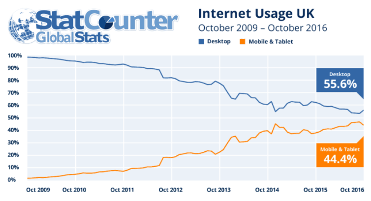
Mobile internet browsing statistics have been creeping up and the gap between desktop and mobile/tablet internet usage is closing. The ratio of hand-held device to desktop visitors that websites receive will always vary site to site depending on their nature, but in general we can assume that nearly half of internet usage is from a mobile or tablet. With that in mind and even Google favouring mobile-friendly websites (and setting its own guidelines), 2017 is the year to invest some serious time and effort into creating amazing mobile-friendly websites.
Shrinking the nav bar
When designing a desktop site you’ve got a ton of space to play with. There’s plenty of room in the header for the logo, menu items to be spread across the width, contact details and even social media links… but on mobile the space simply doesn’t exist. So, unfortunately for the user, the contact information they’re expecting to find in the header is hidden somewhere else so as not to waste vital space on the first screen the user sees. Even small issues like this need to be carefully considered to find the most user-friendly solution.
Navigation is probably one of the most important parts of a website’s overall impression: it’s the glue that holds the user experience together. If a website isn’t mobile-friendly, the chances are that the user is going to be overwhelmed with frustration when attempting to navigate as they try to press tiny (scaled down) buttons. The act of even having to zoom in on a ‘desktop’ website on a mobile device to read the text makes it extremely difficult for a user to find what they’re looking for and they will, in turn, get fed up and try another site. Speaking in UX terms, they’ve failed to achieve their main goal.
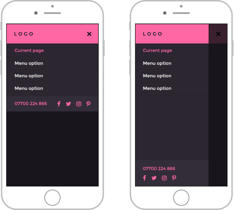
Hamburger icons are a great (as well as a very popular) way to shrink down the navigation into a suitable format for mobile. There are loads of different ways for these menus to expand and you can do some really cool things with them. There are drop downs, slide ins and you can animate the transitions and even the icons themselves, and it’s these little details that add a bit of enjoyment to the navigation process.

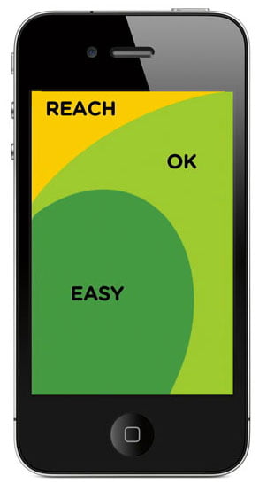
The hamburger icon is nearly always placed at the top left or right of the screen. There are arguments for placing it on either side and, often, it will depend on the layout and design. Having said this, the following diagram shows the ease of touching different areas of the screen with the right thumb and makes a point that’s hard to argue with if approximately 67% of users are using their right thumb.
Whether you choose to place the menu icon on the top left or right, you should think carefully before you change the traditional 3 lined hamburger icon. Apple, sort of surprisingly, have modified the hamburger icon to just 2 lines on their website, but the 3 lined icon has become the norm and is what users know. However, if your typical user might not be so familiar with this icon, you could simply use the word ‘Menu’ instead. A study which A/B tested the hamburger icon against the word ‘Menu’ actually found that iOS users were more likely to press the hamburger icon, whereas Android users used the ‘Menu’ button more frequently. As with everything UX, there are going to be all kinds of studies for all kinds of applications which back up every solution to a problem… so first and foremost you should find the solution that’s right for your typical user by implementing and testing.
![]()
Buttons and making the most of touch
Designing buttons for mobile or touch is a completely different ball game to designing for a desktop screen with a mouse. Desktop websites can get away with using tiny buttons and links if they want to as the user has a pointer to click small targets… but there are many shapes and sizes of fingers and thumbs that use internet on a mobile and these need to be considered.

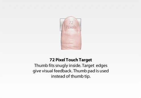
Apple's iOS Human Interface Guidelines recommend that the target size should be no smaller than 44 x 44 pixels. As shown above, this doesn’t mean that your clickable icon needs to be this big (as it can look clunky), but your clickable area should be. Other companies like Microsoft actually recommend a smaller minimum, with their suggestion being no smaller than 26 pixels.
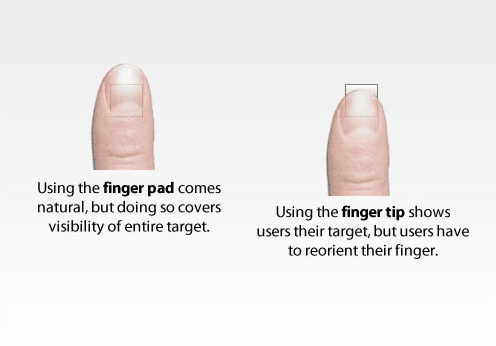
You can press a button with your finger pad (you won’t be able to see the button but if it’s surrounded by sufficient padding you shouldn’t need to) or you can tap with your finger tip (which will allow you to see the target better). But you could probably estimate that a large amount of mobile users are holding their phone in one hand and are tapping away with their thumb (which according to Smashing Magazine, equates to a width of 72 pixels) so Apple’s suggestion of 44 x 44 pixels seems more adequate.
Desktop websites also have a huge advantage of the wonder that is the hover. By adding a hover state on a button, we’re allowing a user to clearly see that the area is interactive or clickable, but on mobile we just don’t have this capacity so it’s even more important to make buttons more accessible in every other way possible. Take animation for instance, consider making the buttons subtly animate in as the user scrolls, placing more emphasis onto them.
Type in mobile design
Apple recommends in its medium Dynamic Type Sizes that body text should be 16 points… but first and foremost you should consider your user. For instance, if you know that your audience is going to be predominantly older, (because there *are *older smartphone users) you should consider increasing type size a couple of points from what you would normally use. But this doesn’t mean you can’t use smaller type, especially as part of a more complex typographic hierarchy. Also remember that, as with clothes from different shops, different fonts come out at different sizes.
A really good and thorough guide to type sizes is:
http://typecast.com/blog/a-more-modern-scale-for-web-typography
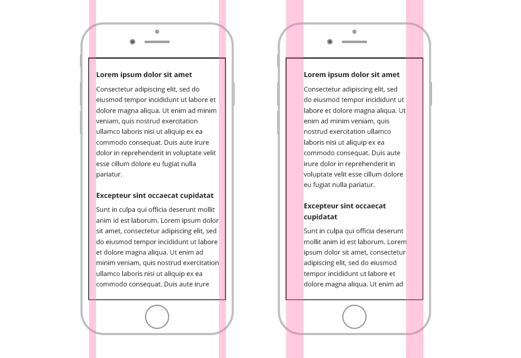
Make sure to choose suitable margins and padding. When designing websites for desktop we can get away with leaving loads of space around chunks of text but on mobile it’s important to make the most of the limited space to avoid lengthy pages. More padding also helps to increase the line length: short line length actually decreases legibility as your eye has to travel back too often, interrupting the reader’s rhythm.
Working mobile upwards
If mobile is becoming a more prominent platform for using the internet then why does it seem to get left until last by so many designers? Maybe it’s too tempting to start designing the desktop version of a website. After all, you get so much amazing white space to put all these great features, text and img onto. But on the other hand, you’re leaving yourself with a massive problem when you’re forced to try and shrink it all down.
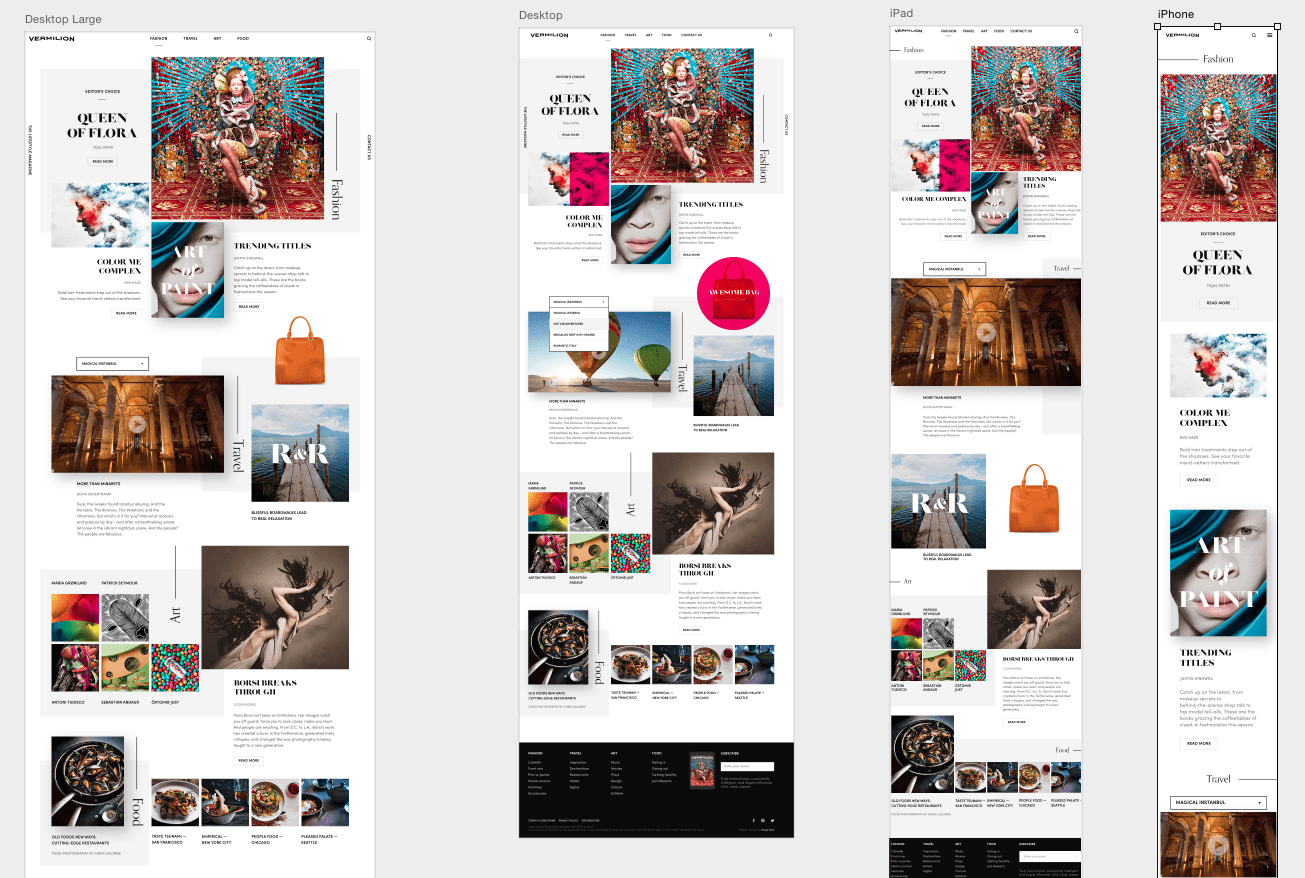
If you’re a web designer, you’ll know the problems you’re left with if you design desktop first, even if it does seem more appealing to start from that point. The principle here is simple: expanding or adding to something is much, much easier than trying to shrink it down. That’s where Photoshop or Sketch artboards come into play, where you can design different device layouts at the same time.
Forms… keep them simple
One of the downfalls of touch screen devices (especially mobiles) is that the keyboard is tiny and this makes filling in any kind of information a frustrating task for the user so it’s great to streamline this process where possible.
If you’re designing a website for a service which demands data capture or perhaps relies on contact forms or even search fields then it’s especially important that forms aren’t a hassle for the user. For example, where mobile is concerned, try to reduce the number of fields if you can, and the fields you really do need- make it easy. Use drop downs where possible, automatic address finders, automatic location finders. Fields should also be a suitable size so they’re easy to tap into. These small additions will dramatically increase the user’s satisfaction; the less frustration the user experiences, the less likely they are to leave the site.
Drop the pretty pictures… pick up speed
Although us designers love a pretty picture, sometimes the img need to be dropped.
39% of people will stop engaging with a website if img won’t load or take too long to load.
img can be a killer for loading time, but if you do want to keep your img in places, save a completely different file for your mobile site. It’ll look the same to the user but it will be relevantly cropped, resized and optimised. In an ideal world, us designers would love to keep our fancy parallax, full-width img, but it’s just not always possible for mobile design. Make sure to do everything you can as a designer when providing the files to developers.
As well as slower loading speeds, large img can take up vital space (particularly height) on the screen and can make for extra, unnecessary scrolling. This can be helped by adjusting the width to height ratio in your img.

It’s good to stereotype
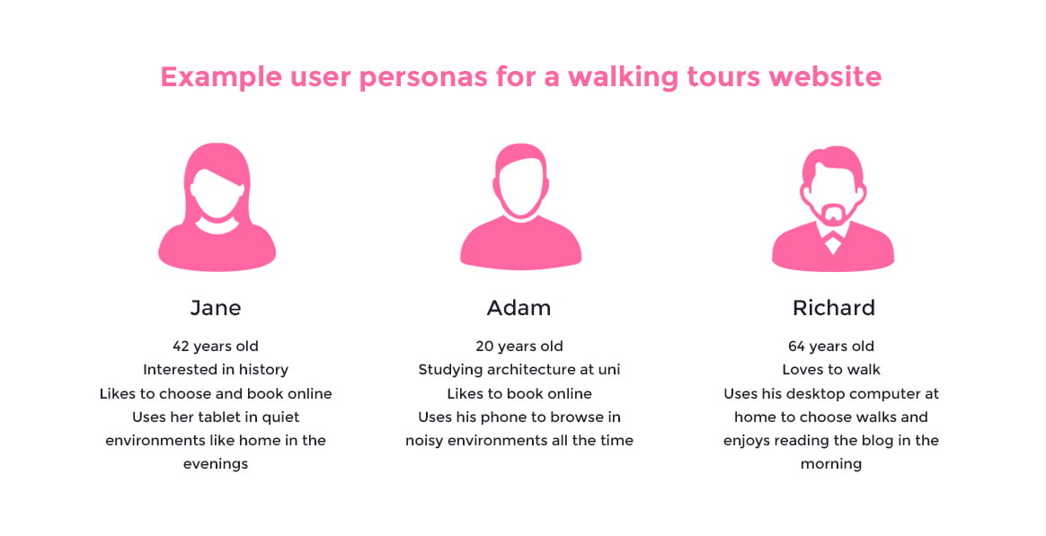
It’s not very often you’ll hear that stereotyping is what you should do, but you can’t base your design on every single user you’ll ever encounter, so you need to create a user persona, or even a few. These are profiles of who your typical user is. This is a very important part of designing a website (desktop, mobile or other) because it puts you, as the designer, in the mindset of the user… What are their motivations? What are their goals? What is their main goal when they enter the site? What time of day is it? What sound levels are there? When we establish the answers to these questions we can focus on creating user journeys. Do some research into who your users are and even find a ‘typical’ user to ask questions to. Below is an example of some very basic user personas; the more detail you can put in, the better.
Wireframe and test, test, test
Use wireframes before you even start to work on the real thing. These can be hand-drawn with good old fashioned pencils and paper or they can be created with one of the many wireframing tools, like Moqups, you can find online. The beauty of wireframing is that you can test and challenge your user journeys before you waste time on the UI.
Gather some participants who fall into your user persona groups (who aren’t familiar with the project) and ask them to perform a certain task; booking a service or finding contact details. Watch, or even record, their process and ask them questions about how easy they found the task. Did they have to think between each step? Did they make any mistakes? Did they take a path you didn’t expect them to? This will allow you to evaluate whether your wireframes are successful or not.
The website is launched so it’s finished, right?
Wrong. Make the most of analytics. We can’t see everything about website visitors but make the most of what you do know. Look at when you get visitors, which pages are the most used? Which pages are the most accessed from mobile devices? Work on these and never stop improving and testing.
Mobile website UX summed up
- Always look at other mobile sites out there and take note of their positives. Similarly, take lessons from the bad websites you come across and don’t make the same mistakes.
- Don’t make it difficult for the user. Try not to challenge their expectations too much.
- Make the navigation simple by using a hamburger icon in the top left or right of the screen.
- Make buttons known to your user and make them easy to press with adequate clickable areas.
- Use suitable text sizes for your audience and choose margins and padding wisely.
- Work mobile up. Always try to start with mobile designs and expand features onto tablet and desktop. Use artboard tools on Photoshop or Sketch to help with this.
- Make forms simple. Cut them down where possible and make the user’s life easier with features like automatic address finders.
- img… Lose them or optimise for mobile. Crop and resize to cut down loading times.
- Wireframe your designs and don’t forget to test, test, test.
- Most importantly… Always consider your user.
