How much do you consider accessibility when writing Android apps? So far, I'm embarrassed to say I've done little more than the default. For example, I'd add content description strings to all my user interface controls and then hope the accessibility tools were good enough to help navigate my apps.
However, after a recent conversation with RNIB I decided to test my latest app Depart: London Transport Live with the TalkBack tool from Google that helps the blind and vision impaired navigate their phone.
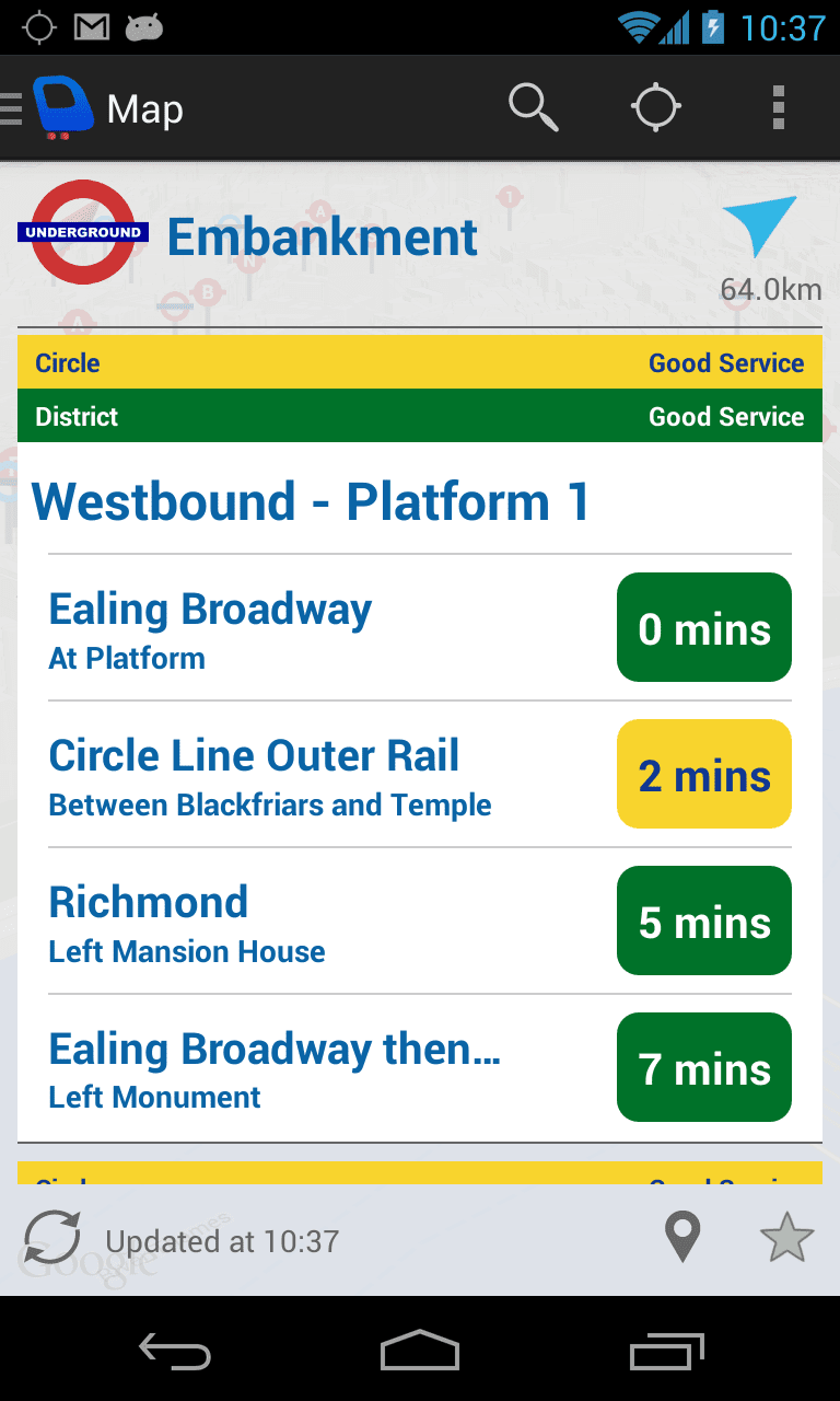
The results were awful. There was no way the app could be used with TalkBack alone. Although the text could be clicked on, it was read out with no context. For example, the screen below shows a tube departure board from within the app.

It conveys a lot of information that can all be gleaned from a glance, including:-
The stop being shown is an underground stop, called Embankment, that is 64KM away (I'm currently at home!). The Westbound platform serves the Circle and District line both of which are operating with good service. There is a train at the platform, it is for the District line heading towards Ealing Broadway. The next Circle line train is 2 minutes away, followed by another District line train 5 minutes away. But if you attempted to use the application with TalkBack you just received a seemingly random set of strings related to travel. You may hear, "transport symbol", "Embankment", "0 mins", "At platform", "Richmond", etc.
The app was more of a hindrance than a help, and this is all assuming you could have navigated to the correct screen anyway. Trust me, you couldn't have.
But isn't it hard to make the app accessible, I asked myself? And, what about my design. I spent a long time making the design as easy to read as possible, something I'm proud of. But has the design made it even less accessible? It turns out No, on both counts. Making apps accessible isn't hard, and you don't need to impact the design!
The good news is, when you start testing with tools like TalkBack it becomes obvious where the weaknesses in your app lie, and Android is great at giving you the tools to fix them.
For example, I needed to group sections of the UI together so they could be read aloud with context. If you consider the section below.

When a user touched this area with TalkBack with the default code they may hear audio as, "Richmond", or maybe "5 mins" depending where they touched first. But ideally I wanted to group the whole area into one touch target, and provide more context in the sentence supplied to TalkBack. For example, when this area is touched it should say, "District line towards Richmond arriving in 5 minutes".
Luckily, Android provides the tools to do this with relative ease. The simplest way is to make sure each desired touch area is grouped in a layout control, and then call setContentDescription() for that view with the desired sentence.
If you take the time to do this, your apps will be greatly improved for users that require TalkBack and for very little effort on the developers behalf. Here's a quick video of Depart running with the changes made:-
There's still a lot more that could be done to make the app fully accessible, and I'd love to hear any ideas you have?
But as a start we should all being doing the basics to make our apps more accessible. I know I will be in the future.
