Here are the top 50 design and development terms which fly around our studio:
404 page
A 404 page is used to show a website user that the server could not find the requested page.
Alpha testing
Alpha testing comes before beta testing. Developers will alpha test to see if a website or new feature is ready to be tested by real life end users. Major changes and fixes occur during this stage.
Animation
Animation refers to how we animate websites. This couple be as simple as a hover effect on a button, or something more complex like animating background shapes behind the content as the user scrolls.
Source: Behance
Backend development
Backend development tackles areas of a digital product which are required to make it work. Backend development includes aspects such as calculations and business logic, as well as database interactions and application performance.
Beta website / testing
Considered to be the last stage of testing — a website used for the real life testing of a new site or features (by end users) before they are launched. Small tweaks are usually made in this period.
Body text
The main chunks of text on a page or document. Usually under headings.
Brand mark
A brand mark is an element of a brand which allows you to identify it — usually a symbol or graphic. Our logo is made up of a monkey head brand mark and the text ‘MONKEYSOURCE’.
Browser
Browsers are applications which are used to access websites. Examples of browsers are Chrome, Safari and Firefox.
Bug
An error or glitch in a computer program or system that produces an unintentional or incorrect result, or causes it to behave in an unexpected way.
Cache
A cache is an area of a computer or application where temporary files are stored. The purpose of a cache memory is to reduce the time taken to access data from the main system memory.
CMYK
Colour values used in print design. Cyan, Magenta, Yellow, Key (Black).
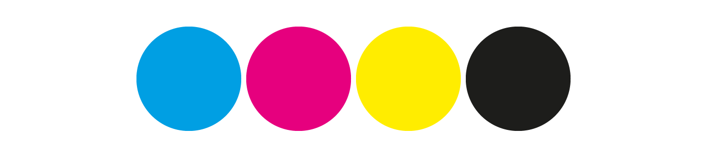
CMYK colours
Code
In simple terms, code is a set of instructions to be executed by a computer.
Copy
A document or chunk of text provided to be used on designed materials. Also known as content.
EPS
A graphics format for vector images which allows them to be edited and rescaled without loss of resolution.
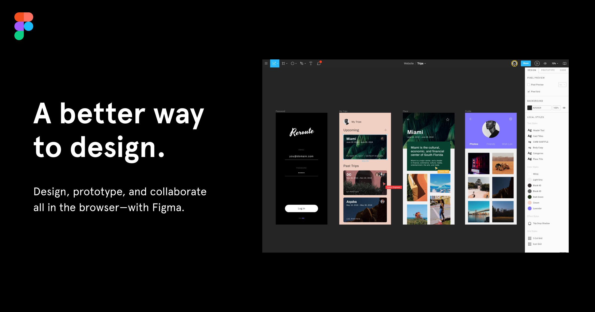
Figma
Figma is our latest design tool of choice at MonkeySource. Figma allows a streamlined design process from low fidelity prototyping, to asset creation, to exporting the properties needed for development itself.
Source: Figma
Front-end development
A front-end developer uses web technologies to develop websites and applications for users to interact with directly.
Grid
A grid is made up of columns and gutters (or padding) and is commonly used in screen design. The grid allows the developer to use appropriate responsive practices.
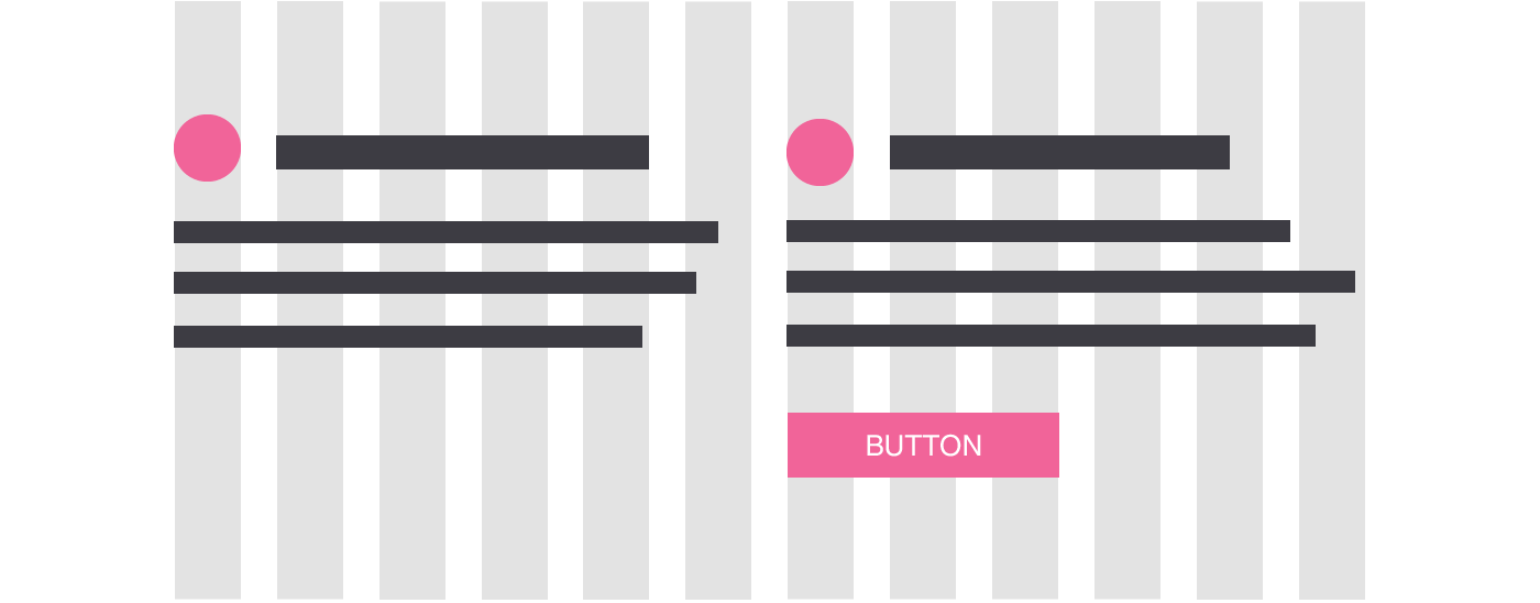
An example of grid design for desktop
Hierarchy
We use the term hierarchy to refer to the layout of visual elements in a way that suggests order of importance.
High fidelity designs
High fidelity designs refer to a polished set of designs, which have already gone through functionality testing (such as wire-framing and prototyping). High fidelity designs focus on finer design details.
Hybrid app
Hybrid apps incorporate aspects of native and web applications. They allow an app to be built just once, but published on multiple platforms, which can reduce costs.
JPEG
Typically a smaller file size, a JPEG allows you to compress an image to an adjustable degree to maintain image quality, whilst keeping a sensible size for storage purposes.
Kerning
Individual spacing between letters to give the illusion / create optically evenly spaced letters. Unless you’re a typography professional, best not to be messed with. The pink text below shows properly kerned letters, against evenly spaced letters below it.
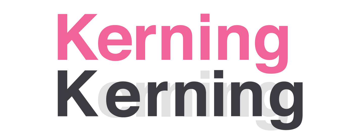
Kerning examples
Languages
Different languages are used to write code. Coding language examples include SQL, Java, Javascript and C#.
Leading
Also known as line height. The space between lines. Especially important for readability.
Legibility
The collective term for how legible a piece of text is. Includes factors such as font choice, font size, relative line height, line length. Extremely important to make your readers want more.
Logotype
The wording in a logo is called the logotype. Logotype is commonly placed next to a brand mark.
Lorem ipsum text
“What’s that funny text on the designs?” Understandably, this is something we hear a lot — a latin script commonly used as placeholder text where copy is not yet available. Avoids distraction from the designs themselves.
Lorem ipsum text
Low fidelity designs
Low fidelity designs are created to test the functionality of a website or application before high fidelity designs are created. Low fidelity designs allow the basic underlying design structure to be tested without having to cover all of the finer design details.
Mobile first approach
A way of designing which starts by designing for mobile screens. A particularly important and forward-thinking practice, considering that (an increasing) 50% of internet users are on mobile devices. This enables mobile designs to be expanded for bigger screens.
Native app
An app native to the device it is built for. A mobile app, for example, could be native to Android, Windows or iPhone.
Orphans and widows
Typographers avoid orphans and widows. Single words on a line (orphans) and the last line of a paragraph falling at the top of a page (widows) disrupt reading flow and are a definite ‘don’t’.
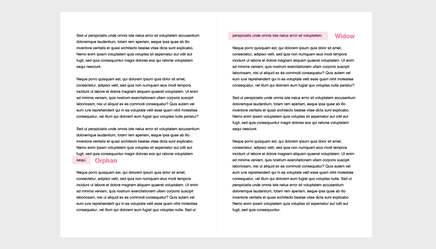
An example of orphans and widows
Padding
Padding refers to the space around each element on a page.
PDF
The PDF (Portable Document Format) is a file format created by Adobe in the 90s, and is commonly used to present documents which have formatted text and images.
PNG
A popular image format which allows you to save lossless files and supports transparency properties.
Resolution
A low resolution image will appear blurry. The standard considered optimum resolution for print is 300dpi, with the standard for screen being 72dpi.
Correct resolution vs. low resolution
RGB
Colour values used in screen design. Red, Green, Blue. Used as an alternative to hex codes.
Release candidate
After the testing phases, a release candidate is a site or app which is considered completely ready to be launched into the real world / desired target audience.
Responsive layout
A design which considers all screen sizes. Responsive layouts automatically resize, hide, shrink and enlarge to optimise content for the screen size.
Rivers of white
Rivers of white occur when there are too little words per line and/or text is justified, which causes gaps to form in a paragraph of text. Rivers of white negatively affect reading flow but can be easily avoided by ensuring that lines consist of a sensible character length and the paragraph itself is not justified.
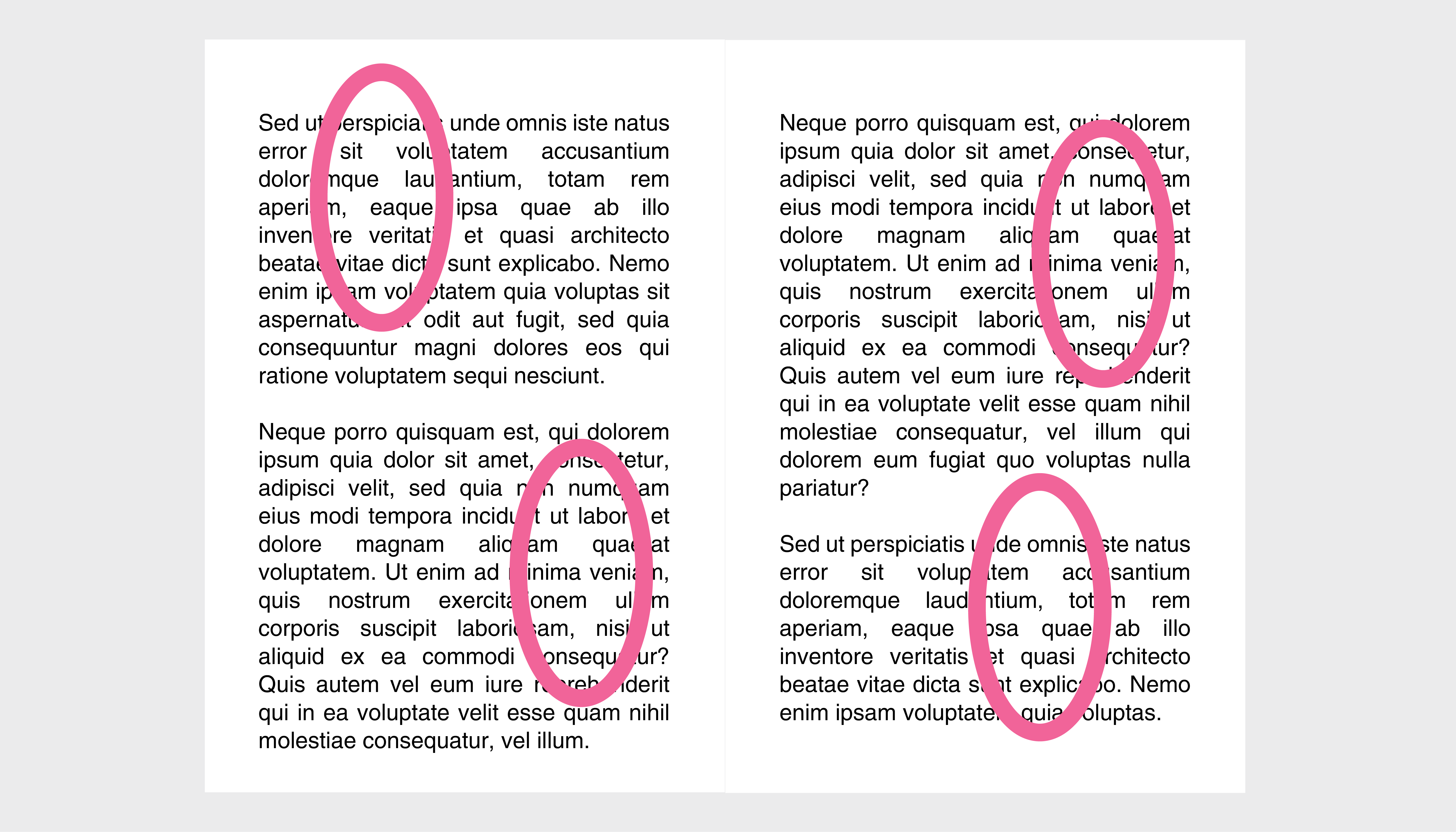
Examples of rivers of white in justified text with short line length
Sans serif typeface
‘Sans’ (‘without’ in French) = without a serif. Fonts like Helvetica, Arial & Open Sans are sans serif. Considered modern and contemporary.
Serif typeface
Considered to be classic and traditional. Fonts with slight projections finishing off strokes in their letters.
Serif A
Site map
A site map is created to scope out each page on a website or application in the early stages of planning, before wire-framing and prototyping occurs.
Style guide
Style guides are created to ensure consistency across a website or application. They include colour palettes, typography rules, button and other element styling rules, padding rules and much more.
Transparency and opacity
The less transparent something is, the higher its opacity. Percentages we use to define how much of the underlying element we would like to see.
A partially transparent logo
Typography
Everything wordy. The skill /technique of arranging type so the words (or content) are optimised for legibility, readability, and are appealing to read.
UI design
User interface design. Focuses on the visual elements and styling (which the user interacts with) of a website or application.
UX design
User experience design. Finding the solution to optimum user satisfaction with a product. Involves user personas, user journeys and a lot of thinking about the how.
Web app
An app which is not native to any particular device. Effectively a cross between a website and an app. They can be accessed from a browser but can also be wrapped and submitted to app stores for download.
Wire-frames
A visual diagram-like representation showing how a page will be structured before any design is considered. Typically used to figure out user journeys and site navigation.
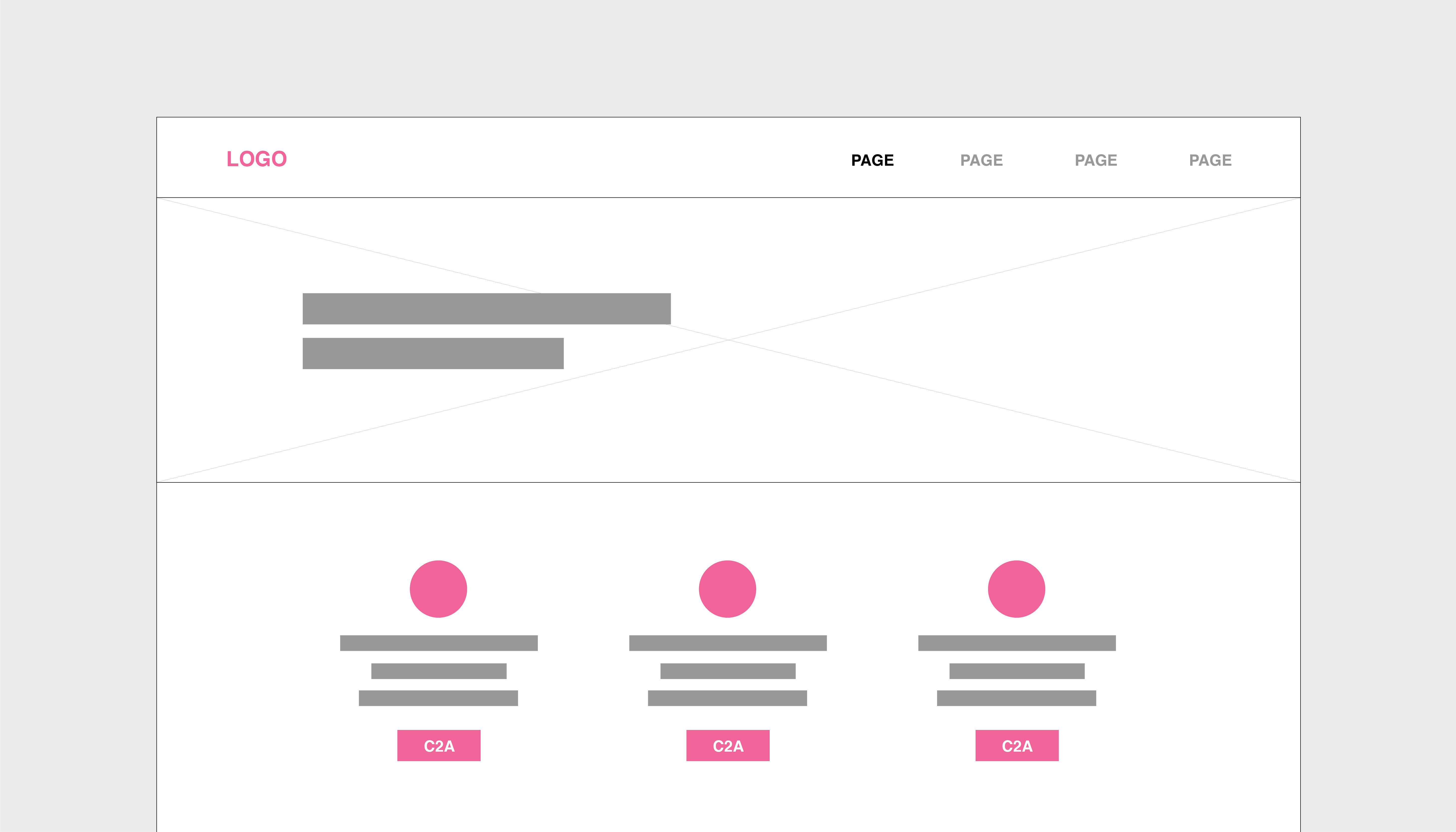
An example of a basic wire-frame
Working prototype
Opened in a browser, this is a mocked up version of a digital product which can be tested and used like a normal website before it is actually coded. Consists of flat designs with hotspot links. We use tools like Invision and Figma to create ours.
Interested in working with MonkeySource on your next project?
You can email [email protected] or contact us here.