project brief
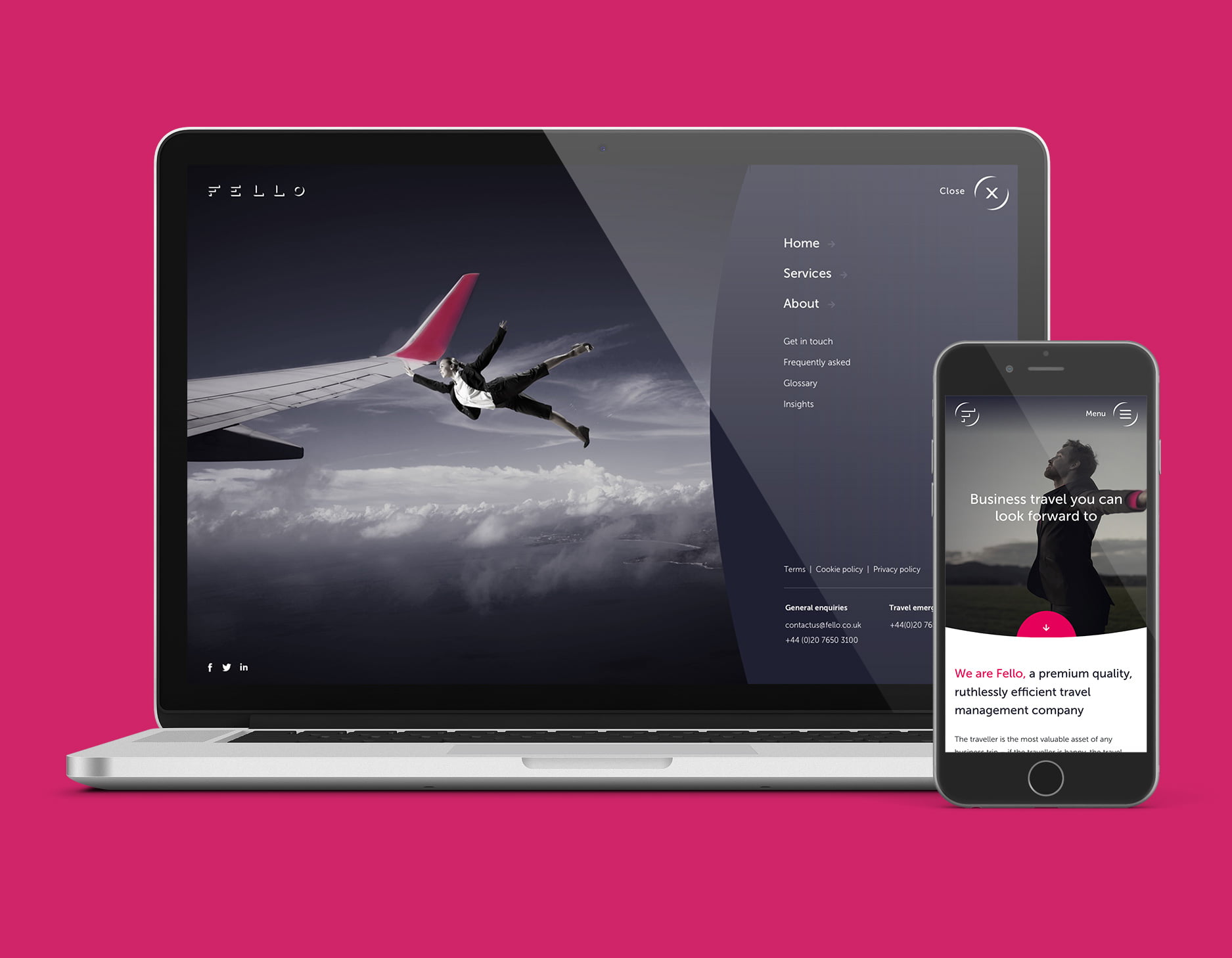
Two large travel management companies have merged into one - Fello. The project started with wireframing the site and testing several user flows to determine the placement of certain information. The wireframes were then turned into high fidelity designs using the new brand guidelines. Several elements of animation were included on the site, with the animated hamburger menu being chosen to make the website that little bit more quirky so it would stand out from competitors. We also created a set of 20 custom icons to use across the site.
